Visualisation definition Matrix timeseries chart
The matrix-timeseries chart visualisation type represents data as a matrix/heatmap chart visualisation.
When to use
Use a matrix/heatmap when you want to show patterns, intensity, or relationships across two categorical or sequential dimensions. Heatmaps are especially effective for quickly spotting clusters, outliers, and high/low concentration areas through color. Choose a matrix/heatmap when:
- You have two variables (e.g., time × category, metric × metric) and want to visualise how values vary across that grid.
- You want to reveal patterns or trends that are easier to see through colour gradients than numbers alone.
- You’re analysing large datasets where showing every value in a table would overwhelm the reader.
- Comparing magnitude via colour is sufficient, and exact values are secondary.
- You want to highlight correlations, intensity levels, or frequency distributions at a glance.
- Your audience benefits from visual grouping, such as heat clusters or distinct cold zones.
Heatmaps shine when the goal is to understand the shape or distribution of data across two dimensions.
When not to use
Avoid using a matrix/heatmap when:
- Precise numerical values matter — colour is less accurate than explicit numbers or bars.
- Your dataset has very few data points, making the grid sparse and uninformative.
- There is no clear second dimension — if you only have one variable, a bar or line chart is better.
- Your audience may struggle with colour interpretation (e.g. colour‑blindness concerns or inaccessible palettes).
- Colours don't have a strong meaning tied to the data (e.g., random colours instead of a meaningful scale).
- You need to emphasise ranking or order, which is harder to interpret through colour alone.
- Your categories are too long or numerous, causing unreadable labels or excessive scrolling.
- The data varies only slightly, producing a heatmap where all cells look the same.
Use heatmaps for pattern recognition, not for fine‑grained comparison.
How it works
The Matrix chart uses colour to represent data as two dimensional matrix. Values in a dataset are assigned to buckets which have a colour associated to them.
See Custom buckets for docs on how data is scored and bucketed, and how to define custom buckets.
Definition
{
  id: 'matrix-definition-id',
  type: 'matrix-timeseries',
  display: 'Matrix timeseries chart',
  description: 'Matrix visualisation description',
  option: {
    ...
  }
  column: {
    key: [{ id: 'ts' }],
    measure: [
      { id: 'ts', type: 'date' , display: 'Date' },
      { id: 'id-of-count-column', display: 'Count column title' },
    ],
  }
}
See the Visualisation definition docs for the definition schema
See the Targeting data for and how to target data with the column
Options:
See Custom buckets for options documentation
Data assumptions
- The dataset includes a column with an ID of
tsthat contains timestamp data - Ensure that your measure includes a
typeofdate. - The
tsdate format must beYYYY-MM-DD
Examples
- Automatic bucketing
- Custom base colour
- Custom buckets definition
- Custom buckets thresholds and colours
- Custom buckets with open ended boundaries
- RAG colours
Example Dataset
For these examples we will use a mocked dataset representing finds totals
| ts         |  est_id  | wing  | cell  | finds       | count |
|------------|----------| ------|-------|-------------|-------|
| 2025-02-25 |          |       |       |             | 81    |
| 2025-02-25 |          |       |       | Drugs       | 17    |
| 2025-02-25 |          |       |       | Phones      | 22    |
| 2025-02-25 |          |       |       | Weapons     | 26    |
| 2025-02-25 |          |       |       | Alcohol     | 16    |
| 2025-02-24 |          |       |       |             | 69    |
| 2025-02-24 |          |       |       | Drugs       | 11    |
| 2025-02-24 |          |       |       | Phones      | 9     |
| 2025-02-24 |          |       |       | Weapons     | 30    |
| 2025-02-24 |          |       |       | Alcohol     | 19    |
| 2025-02-23 |          |       |       |             | 92    |
| 2025-02-23 |          |       |       | Drugs       | 14    |
| 2025-02-23 |          |       |       | Phones      | 22    |
| 2025-02-23 |          |       |       | Weapons     | 49    |
| 2025-02-23 |          |       |       | Alcohol     | 7     |
... more rows ommitted
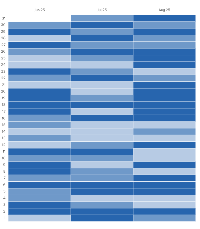
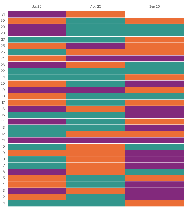
Automatic bucketing
In this example we will define a heatmap that:
- automatically defines buckets based on the values in the dataset
- selects the dataset rows that show the total count of finds for each day
- represent that as a matrix chart that show daily finds over 3 months
Definition
{
  id: 'finds-totals--overtime',
  type: 'matrix-timeseries',
  display: 'Finds totals over time matrix chart',
  description: '',
  column: {
    key: [
      {
        id: 'ts',
      },
    ],
    measure: [
      {
        id: 'ts',
        display: 'Date',
      },
      {
        id: 'count',
        display: 'Total finds',
      },
    ],
    expectNull: true,
  },
}
Visualisation dataset
This definition will return the following dataset
| ts         |  est_id  | wing  | cell  | finds       | count |
|------------|----------| ------|-------|-------------|-------|
| 2025-02-25 |          |       |       |             | 81    |
| 2025-02-24 |          |       |       |             | 69    |
| 2025-02-23 |          |       |       |             | 92    |
... more rows ommitted
see here for more info on targeting data
Visualisation
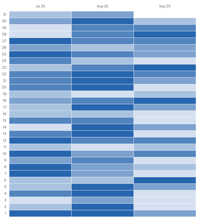
Custom base colour
In this example we will define a heatmap that:
- automatically defines buckets based on the values in the dataset
- uses a custom base colour for the gradient colours
- selects the dataset rows that show the total count of finds for each day
- represent that as a matrix chart that show daily finds over 3 months
Definition
{
  id: 'finds-totals--overtime',
  type: 'matrix-timeseries',
  display: 'Finds totals over time matrix chart',
  description: '',
  option: {
    baseColour: '#00703c'   // <-- Sets the custom base colour
  },
  column: {
    key: [
      {
        id: 'ts',
      },
    ],
    measure: [
      {
        id: 'ts',
        display: 'Date',
      },
      {
        id: 'count',
        display: 'Total finds',
      },
    ],
    expectNull: true,
  },
}
Visualisation dataset
This definition will return the following dataset
| ts         |  est_id  | wing  | cell  | finds       | count |
|------------|----------| ------|-------|-------------|-------|
| 2025-02-25 |          |       |       |             | 81    |
| 2025-02-24 |          |       |       |             | 69    |
| 2025-02-23 |          |       |       |             | 92    |
... more rows ommitted
see here for more info on targeting data
Visualisation
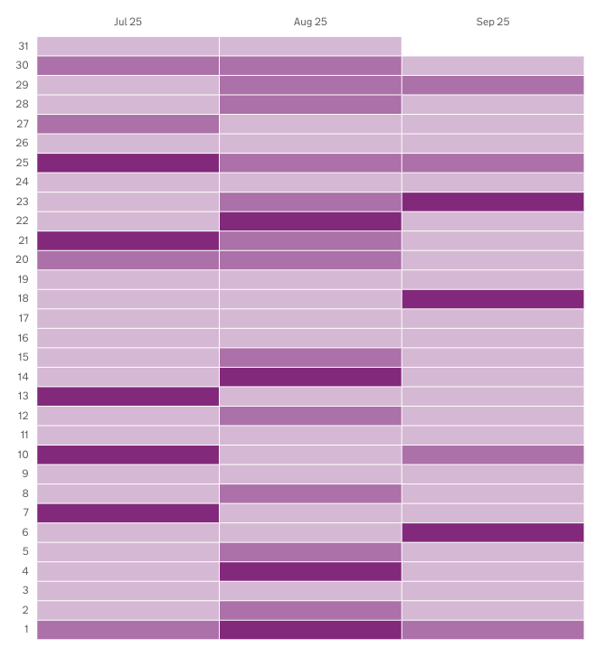
Custom buckets definition
In this example we will define a heatmap that:
- uses custom bucketing to define the bucket count, size and boundaries
- uses the default base colour
- defines 5 buckets
- selects the dataset rows that show the total count of finds for each day
- represent that as a matrix chart that show daily finds over 3 months
Definition
{
  id: 'finds-totals--overtime',
  type: 'matrix-timeseries',
  display: 'Finds totals over time matrix chart',
  description: '',
  option: {
    bucket: [
      { min: 0, max: 20 },
      { min: 21, max: 40 },
      { min: 41, max: 60 },
      { min: 61, max: 80 }
      { min: 81, max: 100 }
    ]
  },
  column: {
    key: [
      {
        id: 'ts',
      },
    ],
    measure: [
      {
        id: 'ts',
        display: 'Date',
      },
      {
        id: 'count',
        display: 'Total finds',
      },
    ],
    expectNull: true,
  },
}
Visualisation dataset
This definition will return the following dataset
| ts         |  est_id  | wing  | cell  | finds       | count |
|------------|----------| ------|-------|-------------|-------|
| 2025-02-25 |          |       |       |             | 81    |
| 2025-02-24 |          |       |       |             | 69    |
| 2025-02-23 |          |       |       |             | 92    |
... more rows ommitted
see here for more info on targeting data
Visualisation
Custom buckets thresholds and colours
In this example we will define a heatmap that:
- uses custom bucketing, defined in the definition
- uses custom colours defined in the definition
- selects the dataset rows that show the total count of finds for each day
- represent that as a matrix chart that show daily finds over 3 months
Definition
{
  id: 'finds-totals--overtime',
  type: 'matrix-timeseries',
  display: 'Finds totals over time matrix chart',
  description: '',
  option: {
    bucket: [
      { min: 0, max: 20, hexColour: '#912b88' },
      { min: 21, max: 40, hexColour: '#f47738' },
      { min: 41, max: 60, hexColour: '#28a197' },
    ]
  },
  column: {
    key: [
      {
        id: 'ts',
      },
    ],
    measure: [
      {
        id: 'ts',
        display: 'Date',
      },
      {
        id: 'count',
        display: 'Total finds',
      },
    ],
    expectNull: true,
  },
}
Visualisation dataset
This definition will return the following dataset
| ts         |  est_id  | wing  | cell  | finds       | count |
|------------|----------| ------|-------|-------------|-------|
| 2025-02-25 |          |       |       |             | 81    |
| 2025-02-24 |          |       |       |             | 69    |
| 2025-02-23 |          |       |       |             | 92    |
... more rows ommitted
see here for more info on targeting data
Visualisation
Custom buckets with open ended boundaries
In this example we will define a matrix chart that:
- uses custom bucketing
- has open ended lower limit bucket, and open ended higher limit bucket
- selects the dataset rows that show the total weapons found for each day
- represent that as a matrix chart that show daily finds over 3 months
Definition
{
  id: 'custom-bucket-open-sizing',
  type: 'matrix-timeseries',
  display: 'Open ended bucket boundaries',
  description:
    'Demonstrates custom bucketing where the first bucket has not lower limit, and the last bucket has no higher limit',
  option: {
    bucket: [
      {
        max: 10,
      },
      {
        min: 11,
        max: 30,
      },
      {
        min: 31,
      },
    ],
  },
  column: {
    key: [
      {
        id: 'ts',
      },
    ],
    measure: [
      {
        id: 'ts',
        display: 'Date',
      },
      {
        id: 'count',
        display: 'Total finds',
      },
      filter: [
        {
          id: 'finds',
          equals: 'Weapons'
        }
      ]
    ],
    expectNull: true,
  },
}
Visualisation dataset
This definition will return the following dataset
| ts         |  est_id  | wing  | cell  | finds       | count |
|------------|----------| ------|-------|-------------|-------|
| 2025-02-25 |          |       |       | Weapons     | 26    |
| 2025-02-24 |          |       |       | Weapons     | 30    |
| 2025-02-23 |          |       |       | Weapons     | 49    |
... more rows ommitted
see here for more info on targeting data
Visualisation:
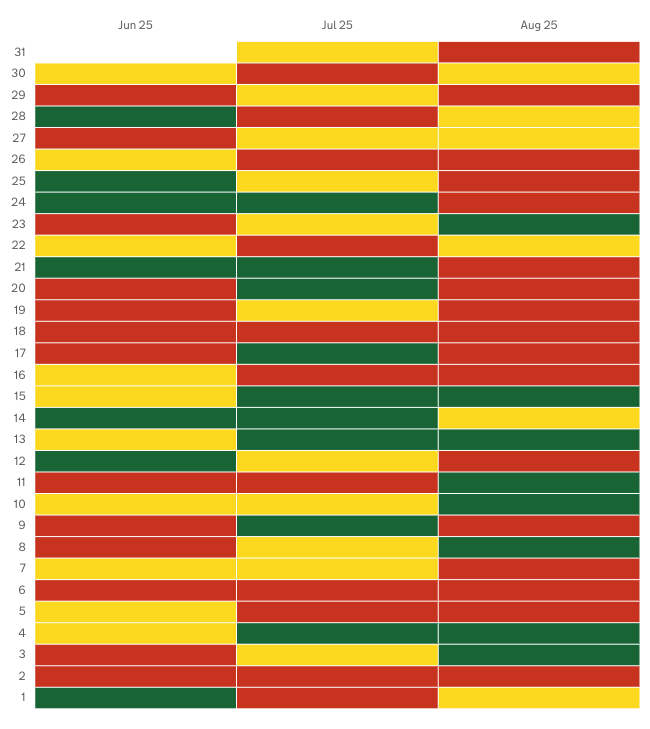
RAG colours
In this example we will define a matrix chart that:
- Uses RAG colouring
- defines 3 automatic buckets
- selects the dataset rows that show the total count of finds for each day
- represent that as a matrix chart that show daily finds over 3 months
Definition
{
  id: 'finds-totals--overtime',
  type: 'matrix-timeseries',
  display: 'Finds totals over time matrix chart',
  description: '',
  option: {
    useRagColour: true // <- Defines the use of RAG colouring
  },
  column: {
    key: [
      {
        id: 'ts',
      },
    ],
    measure: [
      {
        id: 'ts',
        display: 'Date',
      },
      {
        id: 'count',
        display: 'Tota finds',
      },
    ],
    expectNull: true,
  },
}
Visualisation dataset
This definition will return the following dataset
| ts         |  est_id  | wing  | cell  | finds       | count |
|------------|----------| ------|-------|-------------|-------|
| 2025-02-25 |          |       |       |             | 81    |
| 2025-02-24 |          |       |       |             | 69    |
| 2025-02-23 |          |       |       |             | 92    |
... more rows ommitted
see here for more info on targeting data
Visualisation