Visualisation definition Line chart
The line chart visualisation type represents data as a matrix/heatmap chart visualisation.
When to use
Use a line chart when you want to show how a value changes across a continuous scale that is not limited to time. Line charts are ideal for highlighting patterns, progression, and relationships in continuous data.
Choose a line chart when:
- Your data is continuous, but not necessarily temporal (e.g., distance, position, percentages along a range).
- You want to show how values progress along a measurement scale.
- The shape or direction of change matters, such as steady increase, decrease, or curvature.
- You are comparing multiple continuous series on the same scale.
- The focus is on the relationship between points, not individual standalone values.
Use a line chart when you need continuity without implying time‑based trends.
When not to use
Avoid using a line chart when:
- Your data is categorical, such as names, departments, or discrete labels.
- The values are unrelated or non‑continuous, making connecting them with a line misleading.
- You need to compare individual values, not the relationship between them — a bar or column chart is clearer.
- There are very few data points (e.g., 2–3); the line adds no meaningful shape or trend.
- Your x‑axis is time‑based and you need time‑specific formatting, scaling, or handling — use a line‑timeseries chart instead.
- The data includes gaps or missing intervals, which can distort the interpretation of continuity.
Note:
If your data represents values over time, use a line‑timeseries chart instead. It provides time‑aware scaling, formatting, and interpretation specifically designed for temporal datasets.
Definition
{
  id: 'id',
  type: 'line',
  display: 'name',
  description: 'description',
  option: {
    ...
  }
  column: {
    ...
  }
}
See the Visualisation definition docs for the definition schema
See the Targeting data for and how to target data with the column
Examples
Define dataset columns as line labels
In this example we will define which dataset columns to use in the line chart as follows:
- each column will be new line in the chart
- the column value will be represented as the size of the line
- each row will be a new dataset in the chart
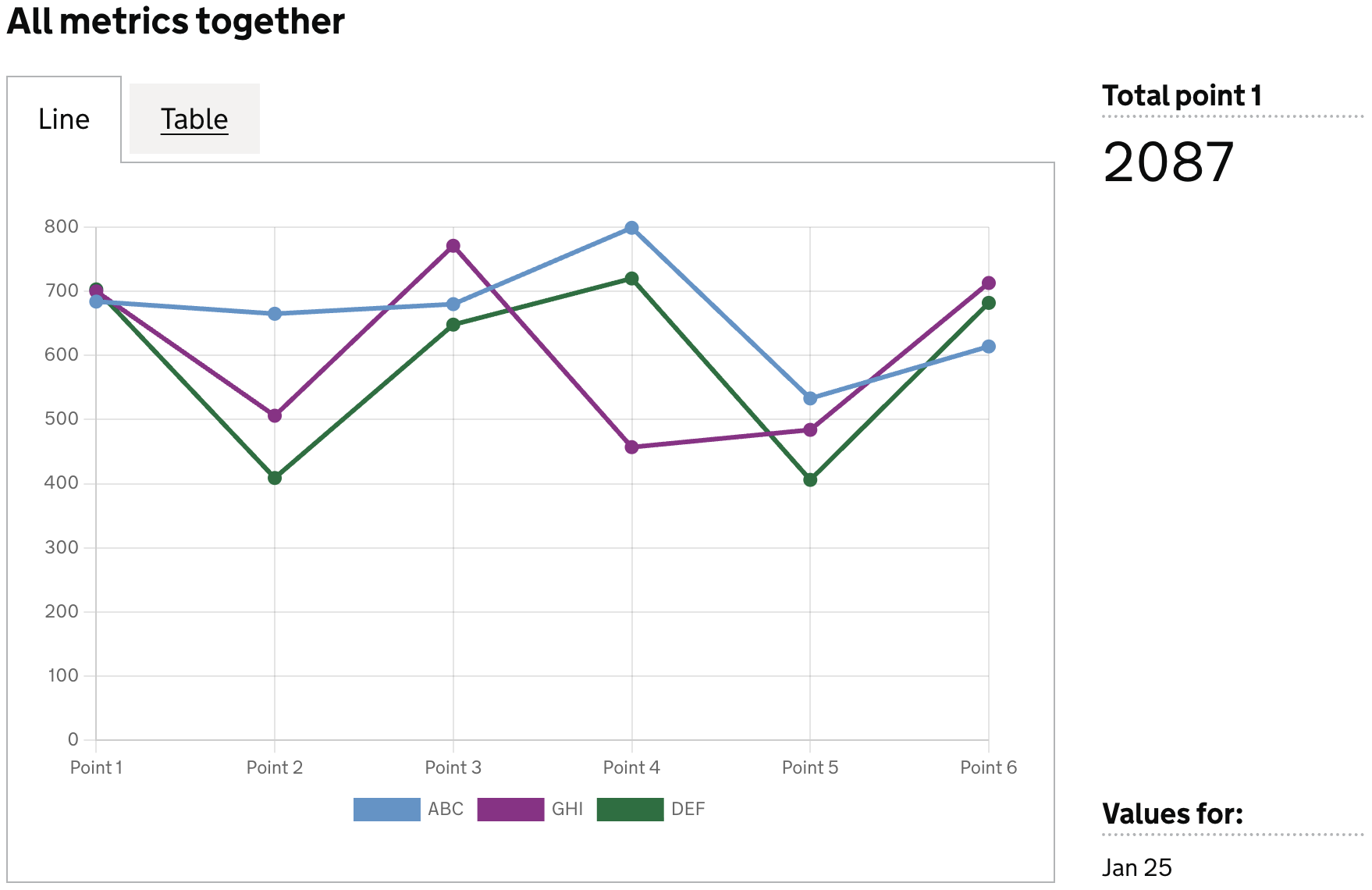
Example Dataset
| est_id | point_1 | point_2 | point_3 | point_4 | point_5 | point_6 |
|--------|---------|---------|---------|---------|---------|---------|
| ABC    | 533     | 614     | 684     | 665     | 510     | 200     |
| GHI    | 484     | 713     | 700     | 506     | 400     | 450     |
| DEF    | 406     | 682     | 703     | 409     | 500     | 570     |
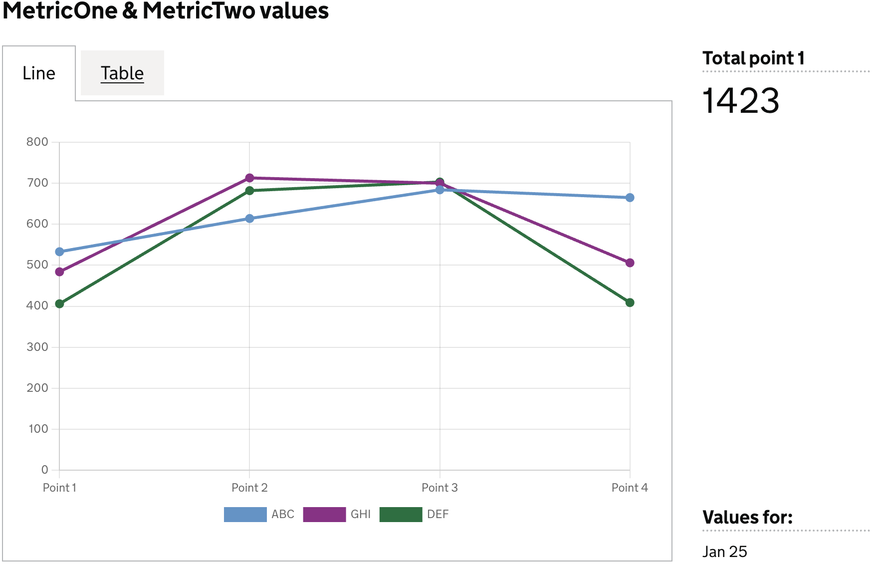
Definition
{
  id: 'bar-data-quality-has-MetricOne-and-MetricTwo',
  type: 'line',
  display: 'MetricOne & MetricTwo values',
  columns: {
    keys: [
      {
        id: 'est_id',
        display: 'Establishment ID',
      },
    ],
    measures: [
      {
        id: 'point_1',
        display: 'Point 1',
      },
      {
        id: 'point_2',
        display: 'Point 2',
      },
      {
        id: 'point_3',
        display: 'Point 3',
      },
      {
        id: 'point_4',
        display: 'Point 4',
      },
    ],
    expectNulls: false,
  },
}
Visualisation dataset
This definition will return the following dataset
| est_id | point_1 | point_2 | point_3 | point_4 |
|--------|---------|---------|---------|---------|
| ABC    | 533     | 614     | 684     | 665     |
| GHI    | 484     | 713     | 700     | 506     |
| DEF    | 406     | 682     | 703     | 409     |
see here for more info on targeting data
Visualisation
Dataset values as labels
In this example we will use values in a specific column for the line labels, and use another column as the values for the bar.
Here we can define the axis field on the specific dataset columns we want to use for the labels (x), and their corresponding values (y)
Note: The values and labels shown in this example are purely illustrative. They do not reflect real‑world line‑chart scenarios and are used only to demonstrate how to structure and display data in this chart type.
Example Dataset
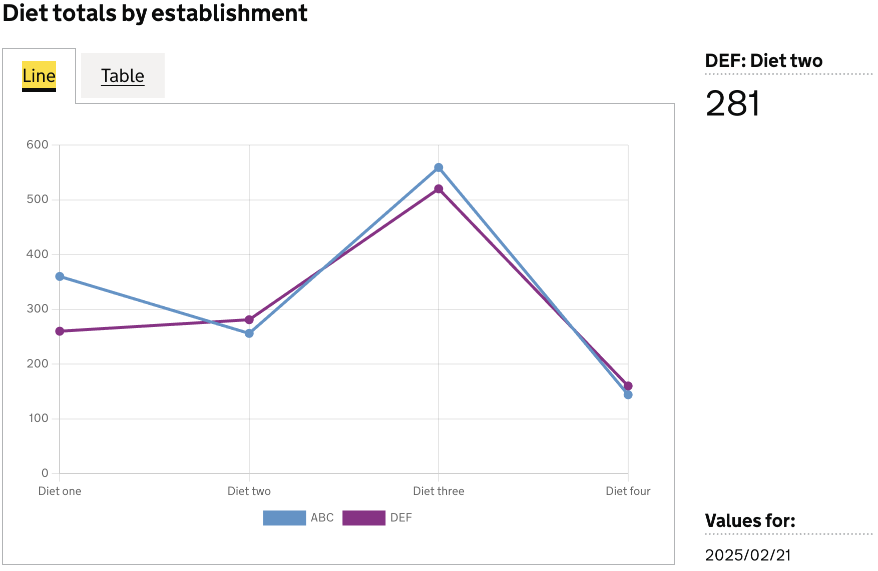
|  est_id  |  wing    | diet        | count |
|----------|----------|-------------|-------|
|          |          |             | 2540  |
|          |          | Diet one    | 620   |
|          |          | Diet two    | 537   |
|          |          | Diet three  | 1079  |
|          |          | Diet four   | 304   |
| ABC      |          |             | 1319  |
| DEF      |          |             | 1221  |
| ABC      |          | Diet one    | 360   |
| ABC      |          | Diet two    | 256   |
| ABC      |          | Diet three  | 559   |
| ABC      |          | Diet four   | 144   |
| DEF      |          | Diet one    | 260   |
| DEF      |          | Diet two    | 281   |
| DEF      |          | Diet three  | 520   |
| DEF      |          | Diet four   | 160   |
Definition
{
  id: 'diet-totals-by-establishment-line',
  type: 'line',
  display: 'Diet totals by establishment',
  description: '',
  columns: {
    keys: [
      {
        id: 'establishment_id',
        display: 'Establishment ID',
      },
    ],
    measures: [
      {
        id: 'diet',
        display: 'Diet',
        axis: 'x',    // <-- column whose values are used as line labels
      },
      {
        id: 'count',
        display: 'Total prisoners',
        axis: 'y',    // <-- column whose values are used as the line value
      },
    ],
    expectNulls: true,
  },
}
Visualisation dataset
This definition will return the following dataset
|  est_id  | diet        | count |
|----------|-------------|-------|
| ABC      | Diet one    | 360   |
| ABC      | Diet two    | 256   |
| ABC      | Diet three  | 559   |
| ABC      | Diet four   | 144   |
| DEF      | Diet one    | 260   |
| DEF      | Diet two    | 281   |
| DEF      | Diet three  | 520   |
| DEF      | Diet four   | 160   |
see here for more info on targeting data
Visualisation