Visualisation definition Bar chart
The bar chart visualisation type represents data as a bar chart visualisation.
When to use
Use a bar chart when you want to compare discrete categories or show differences in magnitude between groups. Bar charts make it easy to see which categories are larger or smaller at a glance.
Choose a bar chart when:
- Your data is categorical, not continuous (e.g., product types, regions, departments).
- You want to compare values side‑by‑side across a small or moderate number of categories.
- Exact comparisons matter, such as ranking or identifying the largest/smallest categories.
- Category labels are long—bar charts handle text better than many other chart types.
- You have a single point in time, rather than values that change over time.
Bar charts are especially effective when clarity and straightforward comparison are more important than showing trends or progression.
When not to use
Avoid using a bar chart when:
- Your data is continuous, especially over time — use a line or line‑timeseries chart instead.
- There are too many categories, which results in overcrowding or unreadable labels.
- Your categories have a natural progression, like days or distances — a line chart may communicate patterns more effectively.
- You need to show part‑to‑whole relationships, where pie or stacked charts are more appropriate (assuming limited categories).
- The focus is on overall trends, not the comparison of categories.
- Your values represent cumulative or flowing data, better suited to an area or line chart.
Definition
{
  id: 'bar-definition-example',
  type: 'bar',
  display: 'bar title',
  description: 'bar visualisation description',
  option: {
    ...
  }
  column: {
    ...
  }
}
See the Visualisation definition docs for the definition schema
See the Targeting data for and how to target data with the column
Options:
option: {
  horizontal: boolean
  xStacked: boolean
  yStacked: boolean
}
| Name | Type | Required | Description |
|---|---|---|---|
horizontal |
boolean | No | Defines whether the bar chart should be rendered horizontally. |
xStacked |
boolean | No | Defines whether the bars should be stacked on the x axis. |
yStacked |
boolean | No | Defines whether the bars should be stacked on the y axis. |
Examples
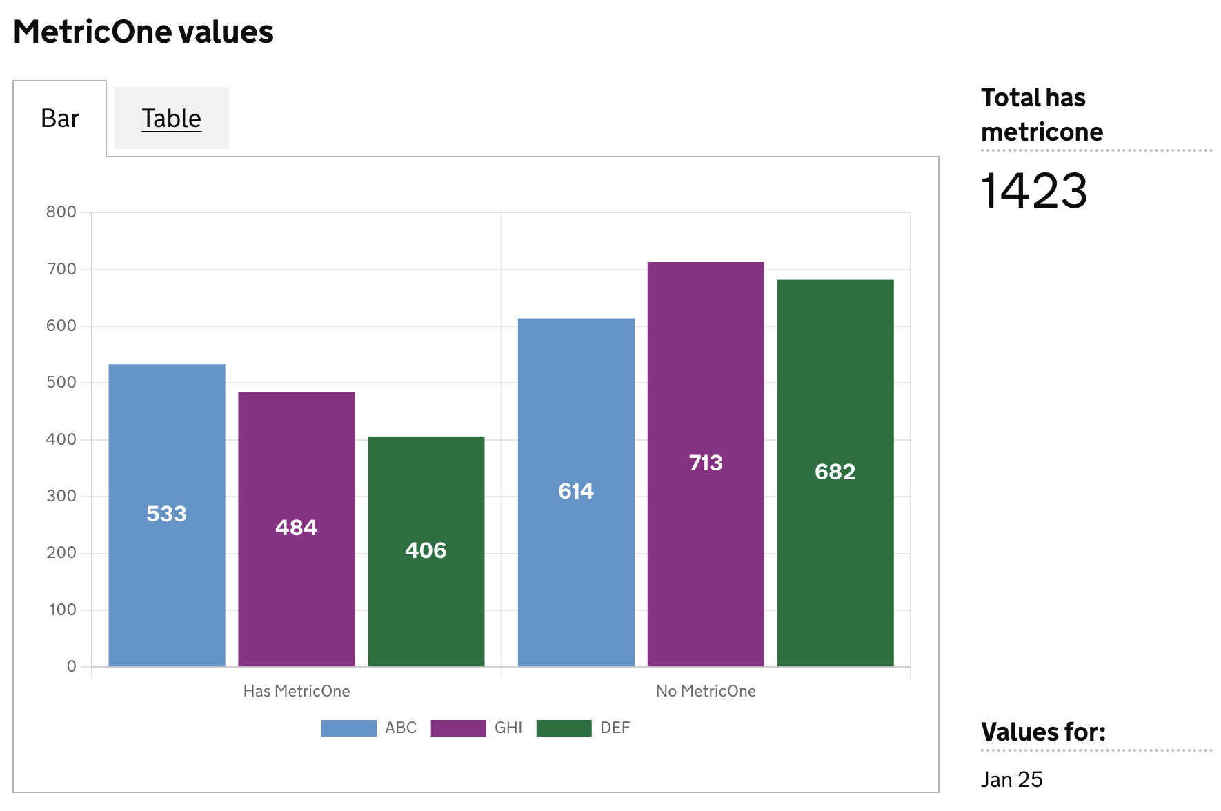
Define dataset columns as bar labels
In this example we will define which dataset columns to use in the bar chart as follows:
- each column will be new bar in the chart
- the column value will be represented as the size of the bar
- each row will be a new dataset in the chart
Example Dataset
| est_id | has_metric_one | metric_one_is_missing | has_metric_three | metric_three_is_missing |
|--------|----------------|-----------------------|------------------|-------------------------|
| ABC    | 533            | 614                   | 300              | 500                     |
| GHI    | 484            | 713                   | 220              | 214                     |
| DEF    | 406            | 682                   | 280              | 320                     |
Definition
{
  id: 'metric-bar-example',
  type: 'bar',
  display: 'MetricOne values',
  description: '',
  column: {
    key: [
      {
        id: 'est_id',
        display: 'Establishment ID'
      }
    ],
    measure: [
      {
        id: 'has_metric_one',
        display: 'Has MetricOne',
      },
      {
        id: 'metric_one_is_missing',
        display: 'No MetricOne',
      },
    ],
  },
}
Visualisation dataset
This definition will return the following dataset
| est_id | has_metric_one | metric_one_is_missing |
|--------|---------------|----------------------|
| ABC    | 533           | 614                  |
| GHI    | 484           | 713                  |
| DEF    | 406           | 682                  |
see here for more info on targeting data
Visualisation:
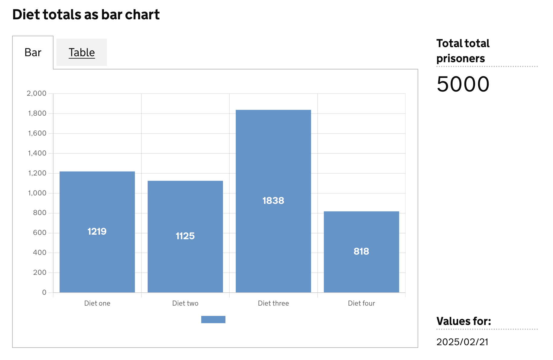
Dataset values as labels
In this example we will use values in a specific column for the bar labels, and use another column as the values for the bar.
Here we can define the axis field on the specific dataset columns we want to use for the labels (x), and their corresponding values (y)
Example Dataset
| ts         |  est_id  | wing  | cell  | diet        | count |
|------------|----------| ------|-------|-------------|-------|
| 2025/02/25 |          |       |       |             | 5000  |
| 2025/02/25 | ABC      |       |       |             | 1109  |
| 2025/02/25 |          |       |       | Diet one    | 1219  |
| 2025/02/25 |          |       |       | Diet two    | 1125  |
| 2025/02/25 |          |       |       | Diet three  | 1838  |
| 2025/02/25 |          |       |       | Diet four   | 818   |
| 2025/02/25 | ABC      |       |       | Diet one    | 169   |
| 2025/02/25 | ABC      |       |       | Diet two    | 463   |
| 2025/02/25 | ABC      |       |       | Diet three  | 397   |
| 2025/02/25 | ABC      |       |       | Diet four   | 80    |
Definition:
{
  id: 'bar-diet-totals',
  type: 'bar',
  display: 'Diet totals as bar chart',
  description: '',
  column: {
    key: [],
    measure: [
      {
        id: 'diet',
        display: 'Diet',
        axis: 'x',    // <-- column whose values are used as bar labels
      },
      {
        id: 'count',
        display: 'Total prisoners',
        axis: 'y',    // <-- column whose values are used as the bar size
      },
    ],
    expectNull: true,
  },
}
Visualisation dataset
This definition will return the following dataset
| ts         |  est_id  | wing  | cell  | diet        | count |
|------------|----------| ------|-------|-------------|-------|
| 2025/02/25 |          |       |       | Diet one    | 1219  |
| 2025/02/25 |          |       |       | Diet two    | 1125  |
| 2025/02/25 |          |       |       | Diet three  | 1838  |
| 2025/02/25 |          |       |       | Diet four   | 818   |
see here for more info on targeting data
Visualisation: